Saturday, 26 July 2014

Vintage Project Evaluation

For this project, i was given a live brief for a client, Advintageous. For this project, i  was asked  to create a set of four bunting flags based on an era from the 1900's to 1960's, along with a mind map about my chosen era, a research sheet into a certain aspect of that era and a sheet of bunting designs.
I chose to research the era 1920's. I chose this era as it is something i personally really liked, I've always been fascinated by the clothes from this era. I also picked this era as it is one of the most well known era's for 'vintage' objects. I wanted to explore the fashion of this era as it was something i thought i could have a lot of ideas and different outcomes with. I also wanted to explore the fashion of this era as fashion from the 1920's is very famously known as 'vintage clothes' and i wanted to really explore the vintage part of this project brief.
Throughout this project i have undertaken alot of research to add to my work. Parts of this research were on the internet, finding out key events/toys/fashion and different interesting aspects about the 1920's. I found this type of research really useful as i could get to what i wanted to know really quickly. I also undertook research on the fashion of 1920's by lending books about 1920's fashion from different library's, reading about the different styles of fashion from flapper dresses and evening wear, what was acceptable and what wasn't. I also used these books as references for my design pages, to take inspiration from the images and information they provided and incorporate it into my own work. I liked this type of research as it was very informative. Because of the methods of research that i have undertook in this project, i had loads of idea's to go in to my designs for my bunting.
Once i had done an initial mind map about as much to do about the 1920's as i could find, i decided to choose to focus on fashion as it was something i had gained the most research for. I developed this into a research sheet, including as many images/drawings/paintings i could gather from that era, incorporating 3D effects such as feathers for the headpieces on some of my paintings, adding actual fringe strips onto my work to use as a dress and also adding glitter. I did this as i wanted to incorporate parts of my specialism into work, but without it being 'too much.' This was hard as my specialism is 3D and at first i thought the only things i could add were wood, clay or metal. Once i got over this i had loads of idea's on how to incorporate 3D styles into my work.


My initial mind map 

My research sheet about 1920's fashion

 From this research sheet i designed my bunting designs. I did this by picking out my favorite aspects of the research sheet, and experimenting with them on a piece of paper, to try and make them into nice, looking designs which also would look as if they fit in with the era, and not just represent the fashion in it. When i finally decided on some designs, i drew them onto a piece of paper, making four different triangle bunting designs in total. I painted and coloured these acrylics and coloured pencils, also adding bits of fringe material and glitter into my designs, showing where i would stitch it on when i had done my design onto calico.


I produced my bunting by transferring them onto magic touch paper, and then using the heat press to transfer it onto calico. I then added glitter and fringe details once it had all finished, to make it look how i wanted it to, using my designs as a reference. I learnt how to use the heat press in this project, something which i enjoyed to use once i had got the hang of it. 
(final bunting designs)
I feel as if i used my time well at begging of the project, as i produced bigger pieces of work than what was asked and still had them completed to the deadline we were given for each piece. Despite this, after i had done my research sheet, i began to fall behind with work and didn't manage my time well at all. I think this was because i thought i had a while to do my designs and put them on bunting but because of this, i took longer than i should have on my first design which resulted in my rushing the other three. I think that in some ways, knowing it was a live brief helped me as it helped me get started on it straight away, knowing i had to get it done. On the other hand, i think that id didn't help as i started to rush my work, in fear of it not being done in time which resulted in my work being of poor quality. 
Overall i am satisfied with my bunting designs as i think the outcomes were as good as i could have made them with the little time i left to actually produce them. I am more satisfied with parts of my project as parts of it were the best they could have been (the mind map and the research sheet) yet other parts could have been much better. I am going to take this into account with how unhappy i was of my work, and in my future projects i am going to ensure that i stay on track , and plan my time so that i don't fall behind. If i would have done anything differently i would have continued with working at the speed i was at the begging of the project as i feel if i did, i would have had longer on my final pieces of bunting to make them look much better than they did.

Card Camera's - 3D Workshop Day 7/8

In our final workshop, we were asked to make a  card camera using a piece of card that had a development sheet from our project work printed onto it. To start this off, we were asked to cut out all of the shapes from a card template, and arrange them onto the development sheet card to see what parts of it we wanted where. Once we had done this we had to stick the template onto the pieces of card using spray adhesive, making sure that it was well stuck down. We then had to trim down all of the pieces so they were the right size that the template was originally. After this, we were able to choose pieces of the template to add stitching to, so that our work resembled the work of Jennifer Collier, who we were also studying about. I chose for a stitched line across the main body of the camera, and multiple at the side of the lenses. Once this had all be done and we were happy with it, we  were able to start and build the model. To stick the pieces together we were using masking tape and double sided tape. By the time we had to make a start on finishing our camera's in the next session, most of the tape had come un-done, to overcome this, we took all of the tape off and glued the pieces together with superglue, which worked alot better. Once i had finished my camera, i was very pleased with the outcomes as it was a lot better than i  thought it would look while i was doing it.
The front of my camera

The back of my camera
Half way through making my camera, i almost gave up as i started to get mad because parts were too fiddly, things weren't sticking and parts of the card looked messy. To over come this, i took apart the parts that weren't sticking and looked messy, i found some black card, which i thought would go well with the colours on the card i was using, and cut them into the right shape and used them instead. This worked really well as it was making things easier to stick together as it wasn't as thick as it was before with two layers of card. 

I didn't really enjoy this workshop as i didn't like how small and fiddly the work was, as it is something im not good at. Despite this, once i had finished my camera, i was really proud of it as from the beginning i knew this was something i would struggle with, and i thought it looked really good especially to say i had no help. 

Making our Photo-Frame - 3D Woodwork Workshop Day 5/6

In this workshop i got to make the photo frame that i designed in the second 3D workshop. I chose to make my design that was based on my favorite book, The Fault in our Stars. I started this by painting a frame that i had already made in a pale blue colour. While i was waiting for that to dry, i decided to cut out the shapes that i were going to stick onto my frame out of thin MDF. I chose MDF as it is light so it wouldn't snap from the weight since some of the pieces went off the frame itself. These shapes were a roller coaster, two champagne glasses, an infinity symbol and a speech-bubble. I then sanded these shapes so that they were smooth and didn't look as if i rushed it, i then began to paint these shapes the colours that i coloured them in on my initial design. Once id done this, i sandpapered parts of my frame down so that the wood colour came through the blue so it looked 'distressed' so that there wasn't too much blue on my frame. After if done this i painted my quotes straight onto the wood using a tiny brush, making sure they were as neat as i could make them. Once everything was dry, i began to stick my objects down onto my frame using pva glue, pressing down onto them until they were dry so they wouldn't move or come off.
My finished frame.
In this workshop, i came across a few problems, one of these were that while i was sticking the shapes onto my frame, one of them snapped, i sorted this by sanding the shape down so that it looked like just one champagne glass, and painted the other one so it didn't look so odd. Another problem i came across was that i thought that it looked as if there were too many quotes on my frame and it took away all the attention than what the picture would be in the middle. I overcame this by painting over one of the quotes, and painting two little people where it were, who are the main characters of the book, so it didn't take away all the attention. Overall i really enjoyed this workshop as i enjoy making this to have a outcome that's not just 2D, and i liked learning how to make an object without taking all the attention away  from the main, center object.

Painting our Camera's - 3D Clay Workshop Day 4

In this workshop we were able to paint our clay camera's as they had been fired. I painted mine using white acrylic paint as it doesnt have a shiny effect after it had dried. I wanted a matte look to my work as that is how Katharine Morling's work looks. I then painted around the edges of my camera and added detail with black acrylic, i did this as this is also what Katharine Morling does. I found this workshop very time consuming as painting all of the small details took a lot of time as it was so delicate. I really liked my outcome from this workshop as it looked how i imagined it to. If i were to change anything it would have been to be more daring with adding the details instead of being scared and just sticking with the basics.


Clay Camera's - 3D Clay Workshop Day 3

For this session, my group and i were asked to create a 3D clay model camera based on the designs of Katharine Morling. I found parts of this workshop very hard as i couldnt master adding the right amount of water to the clay, i either added too much and my model collapsed or too little and it split. Once i got the hang of it, i thoroughly enjoyed it. I added a camera strap and buttons to my camera which were inspired by the ones that Katharine Morling put onto her works. Also, in the back of my camera  made a little 'looking hole' and added a little polarioid picture in it to link my work with my sketchbook work for the project this was part of.


I really enjoyed this workshop as i learnt how to add just the right amount of water to clay, and i liked to experiment and build a camera using clay.

Designing Our Photoframes - 3D Woodwork Workshop Day 2

For my second day in the 3D Workshop we were asked to design a photo frame that we would eventually make. We were told that it had to link in with our current project, which was 'Me, Myself and I'
I chose to design 3 different idea's all based on things that i like.
I chose my first design to be based around music, which has a large influence in my life. I decided that i wanted this design to look like vintage photo's, black and white, slightly brown from aging and fading at the sides. To start off this design, i printed off sheets of sheet music onto tracing paper (so it didn't have such hard lines, it had a softer look) and also keys of a piano to use as a reference. I then chose to cut the sheet music into the shape of the frame and then ripped the sides before gluing it down, this way it would look as if the image was fading from the frame due to old age. I did this to both sides of the frame. I then looked at my piano keys as a reference and drew them onto the remaining space of the frames. I painted over the piano keys in a brown to match the brown of the sheet music so that it all blended together, then painting over the keys in black acrylic.
My design for the Music Inspired Frame.
For my next design, i chose to base it on Funfairs as they are places that i love to visit. I wanted this design to show off all of the aspects of fun fairs that i love such as roller coasters and bright lights against the dark night sky. I started this design by drawing a roller coaster at the bottom of the frame. I then drew a Helter Skelter at the right side of the frame, a ride that i used to love as a child. I coloured these in bright colours to represent the bright lights against the dark sky. I used colours such as yellow, red and blue which stand out. For the background, i used a dark blue to make the rest of the colours stand out.

My design based on Funfaires

For my final design, i based it on my favorite book, The Fault in our Stars. I chose to make this design look as if it was home-made and like someone had stuck little items onto it. To start this design, i picked my favorite quotes from the book. I then wrote them onto the frame, one at the top, one at the bottom and also one at the right side. Because i wanted the frame to look as if things had been stuck on, i drew specific items onto it from the book such as a roller coaster, champagne glasses, speech  bubbles and also an infinity sign. For the colour scheme i chose to use the colours that were used on the cover of the book. I used a pale blue for the background so it didn't take away any attention from the quotes and objects. I then used dark blues, golds and blacks for the objects and quotes so that they stood out.

My design based on The Fault in our Stars

I really enjoyed this workshop as i got to take control of how my work would turn out, and had lots of possibilities of the designs i could have made.

Friday, 25 July 2014

Paper Camera Model - 3D Woodwork Workshop Day 1

For my first lesson in the 3D workshop, we were shown how to make a 3D camera out of a piece of card. We were given a sheet of A4 paper, which had a template of the shapes printed on to it. We had to cut them out with a craft knife, scoring along edges that had to be scored too. Once we had done this, we were shown step by step how to stick the shapes together with glue and masking tape to get an outcome that looks like a camera.
I really enjoyed this workshop as it was something I've never done before and i liked figuring out how to fold pieces of paper together, gluing them and sticking them to make a 3D model. This process is something that i am definitely going to continue to use in my second year at college.

Tuesday, 24 June 2014

Cubist Landscapes - Fine Art Workshop Day 4

For my final session in the Fine Art workshop, my task was to create an abstract landscape. I chose to base my landscape on cubism as i enjoyed the cubism portraits workshop.
To do this, my group and i were given a lot of toy squares and triangles that were all painted different colours. We had to collect as many of them as we wanted, and arrange them in landscape type formation. Once we had done this, we were told to draw the shapes out onto a stretched piece of paper.  We then had to paint them, i decided to use brusho inks and water as the colours were brighter than acrylic or watercolour paint. Once i had done this, my group and i were advised to sprinkle salt over the paints before they were dry, as the salt took away the colour to give an interesting 'grainy' look.
I enjoyed this workshop as it was easy but the outcomes looked really good and intricate. I also learnt that salt took away the colour from brusho inks and watercolours, which was a new technique that i liked experimenting with.
My wooden shapes in the landscape formation.

My finished cubist landscape.

Abstract Painting - Fine Art Workshop Day 3

In my third session in this workshop, we were taught how to paint in an abstract style.
To start with, we were asked to stretch an A2 sheet of paper, and find a place around the set up in the middle of the room, that we really liked.
After we had done this, we had to get a paint pallet and put yellow, red and blue paint in it.
We had to pain the set up in-front of us using only the three colours of paint we were given. With this, we were able to be really messy with our work, as we had to hold the paintbrush half way down. Once we had finished with the three colours we were able to add other colours on top, such as green and brown.
I found this really fun as the painting wasn't controlled, it was free and loose. I also liked how we could layer the paints up to get different effects.
The set up that we were given.

My painting before i added more colours.
My finished abstract painting

Surrealism - Fine Art Workshop Day 2

For my second day in the Fine art workshop, we were asked to paint objects in the surrealism style.
We had to sit around a desk filled with objects, and were asked to paint them.
To paint these objects in a surrealism style, i decided to make the edges of the objects look as  if they're melting, and some of them even bending as if the entire object was melting.
I found this session very hard, as i struggled to paint in the surrealism style. This is because i found it very hard to draw the objects in-front of me realistically in the first place, never mind adding to it to make it look like it was part of the surrealism style.
The set up that we had to paint from.
My Finished painting


Cubist Portraits - Fine Art Workshop Day 1

For the first day in the Fine Art workshop, my group and i looked at the art movement Cubism. We particularly looked at the cubist portraits done by Pablo Picasso.
We were asked to stretch a sheet of A2 paper and were told to draw lots of large triangles/squares on the page to fill it.
Once we had done this, we were told to get a mirror, and in the shapes we previously drew, draw what we saw in the mirror. We were advised not to be too accurate as our portraits were to be as abstract as possible.
I decided that i didn't want my self portrait to be realistic so i drew parts of my face again but in different shapes. Once we had finished drawing, we were able to paint our portraits. To ensure that mine was as abstract as it could be, i took inspiration from the colours that Pablo Picasso used in his portraits. An example of this is that i used a green/yellow tone for my skin and a dark blue for my hair. I also decided to draw around some of the shapes i drew on the page  at the beginning of the session, to add a little more sharpness to my self-portrait.
My Finished Self-Portrait.
I really enjoyed this workshop, i found it fun and a challenge. I particularly enjoyed painting the self portrait as it was fun to experiment with colours and not have to use realistic colours.


Thursday, 15 May 2014

Printing with a Collagraph Relief - Printing Workshop Day 4

In our final day in the Printing Workshop, my group and i were able to print using our Collagraph Relief Prints we made in the previous lesson. to do this, we had to apply a colour of oil paint (preferably dark to start with) and rub in onto the relief print, removing the excess ink. After this we could add more and more colours onto the relief print. Once we had done this, we had to get a piece of dampened paper and once again, lay it over the top of the print and put it through a press.
Unfortunately, after a couple of prints, the ink began to 'bleed' into my design, which i didn't want but it came out with some good effects on the paper.

My Design after being sealed with varnsih. 

My design after a couple of prints, showing the 'bleeding'


Making a Collagraph Relief Print - Printing Workshop day 3

In this workshop, my group and i were asked to make a Collagraph Relief Print.
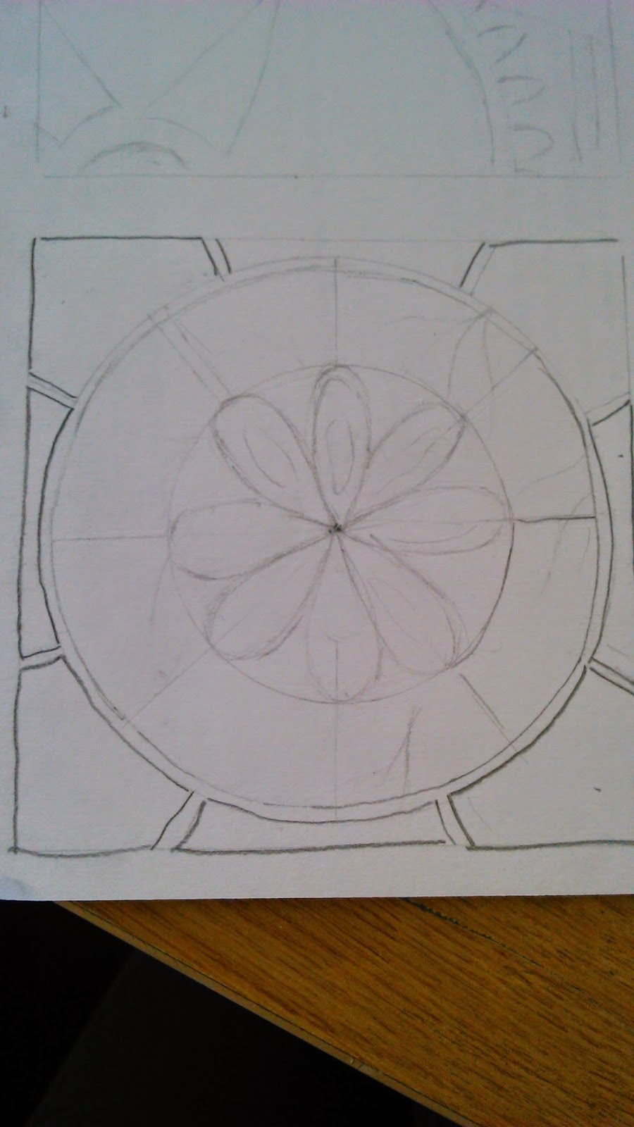
The process of making a Collagraph Relief Print was actually quite easy. My group and i were asked to draw 6 designs onto a plain piece of paper. I decided to make my designs link in with the Nature project we were also studying. My designs incorporated things such as flowers and butterfly wing patterns. After we had done all of these designs, we were asked to choose our favorite and trace it onto a new piece of paper.
We then had to think about the layers of the design, as each layer would be raised higher than the other. After doing this, we had to draw each layer separate than the others and cut them out.
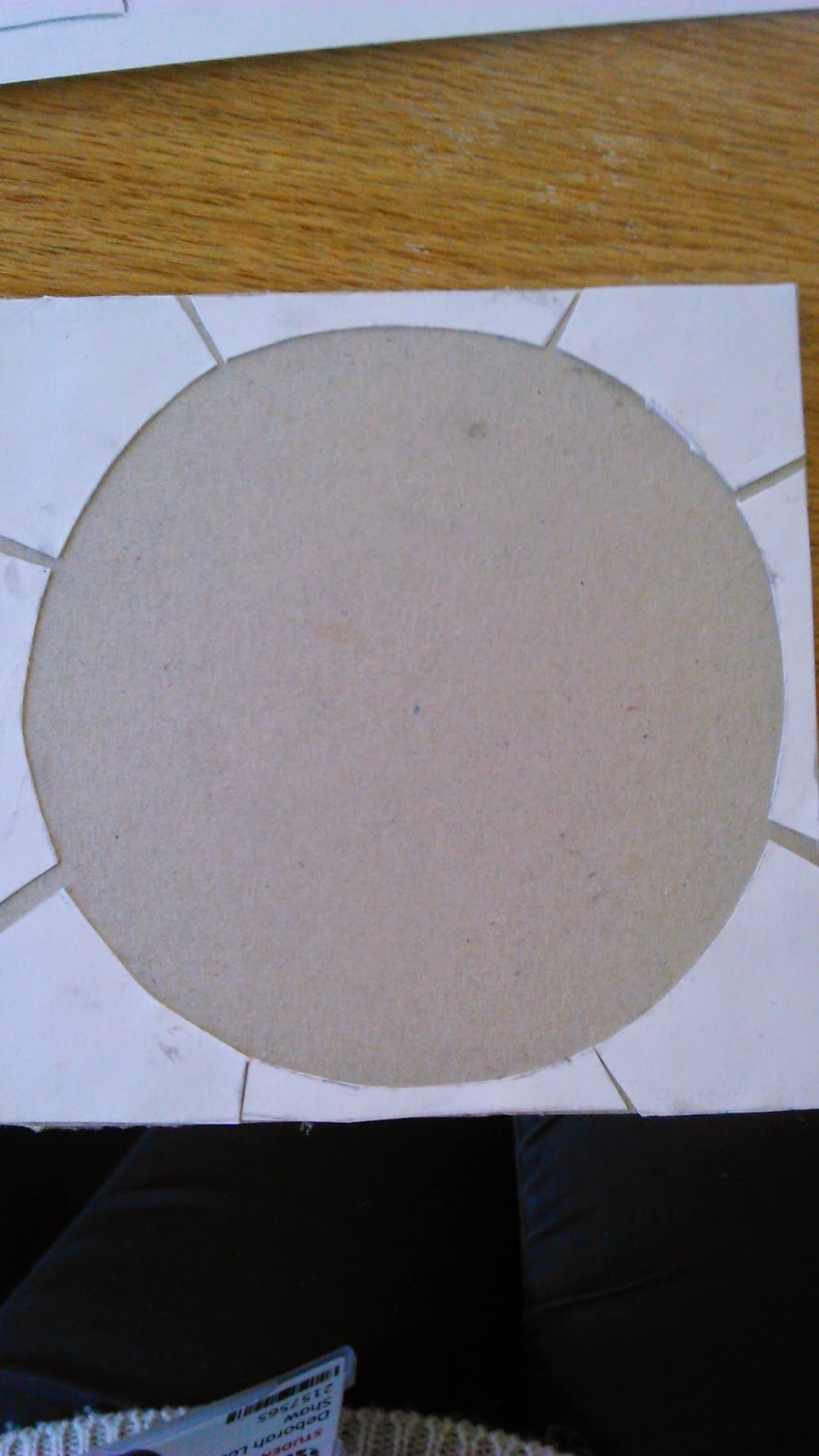
After cutting out all of the layers, we were told to glue them onto a square piece of card, making sure that all of the sides were stuck down so the ink wouldn't get in when we used it to print.
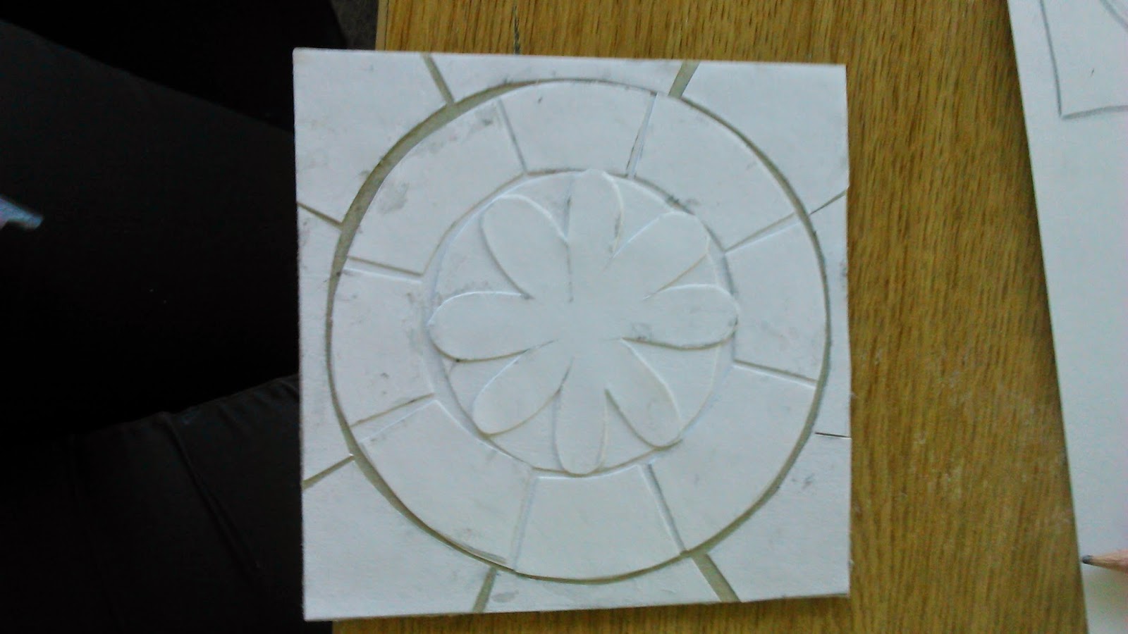
After gluing all of the layers down using PVC glue, we then had to cover it with white emulsion paint and then varnish when it was dry to lock the layers down and prevent ink getting into them and 'bleeding'.
My Original Design

The Traced Layers

Adding the layers onto the Cardboard

Adding More Layers

The Final Product

After making the Collagraph Relief Print, we then were able to print using our previously made Open Bite's. To do this, we had to add a little bit of ink onto the zinc plate, using a paper 'spatula'. We then had to rub the ink all over the plate, ensuring that the ink went into the design. After this we had to rub away the ink with newspaper, making the zinc plate as clean as we could. This is so that the ink that went into the design shows up better on the paper. We then had to get some dampened paper, put it on top on the plate on a press, and roll it through, carefully removing the paper when you'd finished so it didn't tear.


Friday, 28 February 2014

Printing and Creating a Open Bite - Printmaking Day 2

For my second session in the printmaking workshop, we were able to print using the Zinc Plates we prepared the previous session.
To print using this plate, we had to first prepare the paper we were going to print onto. To do this, we dampened the paper, and rolled it in between two layers of blotting paper. Once i had done this, i was asked to apply a little amount of ink onto my plate, and covered the surface of my plate with it by spreading it with a piece of card. I had to ensure that ink was pushed into all of the grooves of my design. Once i had done this, i had to use newspaper to remove the excess ink from my plate, making it look as if there was no ink on the surface to start with, leaving the ink in the grooves of my design.
I then placed my plate onto clean sheets of newsprint on the center of the printing bed, my design facing upwards, placing my dampened paper on the top of it, with more newsprint and a blanket over the top. I then had to wind this through the printing bed without stopping, once my design had gone all the way through, i removed it and placed onto a drying rack for the ink to dry.

After i had done a few of these prints, i was then able to experiment with tissue paper. I repeated the process exactly the same, except when i placed my plate onto the printing bed, i put tissue paper on top, adding glue on top of the tissue paper which touches the dampened paper. I then continued with the same process.

Plain black print.

A print experimenting with ink and tissue paper.
After i had made multiple prints using each process, i was then able to create a plate for an open bite print. To do this, i drew a design onto the back of the zinc plate that i used whilst printing earlier in the workshop. I drew this design on the zinc plate using a black gel type liquid. After i had done this, i had to put a sheet of plastic on the other side of my plate, to protect it from the acid. I then dropped the plate into acid for 5-10 minutes then removed it and rinsed it, cleaning the black liquid off the pattern. After i did this, my plate was ready to use.

My plate before dropping it into the acid.

My plate ready for printing with.

Sunday, 9 February 2014

Etching Print - Printing Workshop Day 1

For my first Printing workshop, i learnt how to make an Etching print.
To start off this session, we were given a zinc plate to draw around onto a piece of paper, making 6 boxes. In these boxes we were asked to draw designs of something we would like to print, we were given free reign with this and could draw whatever we wanted. I decided to base my designs on the style of mandala art as this was something that i personally liked. Once i had done this, we were told to file and burnish the edges of the zinc plate we were given, so that the sides of the plate would not rip the paper we would be printing on. I filed down the edges by using a metal file and the handle of a spoon, making the edges smooth. After this i had to de-grease the plate, using wire wool and a solution to remove most of the scratches on my plate. After this we were then told to put our plates onto a hot plate and wait until they were hot, which we then applied hard ground onto using a roller.
Whilst we were waiting for our plates to cool down, i had to choose my favorite design that i had drawn, and draw it onto tracing paper, which i then placed over my cool zinc plate and drew back over so that it transferred onto the plate. After this i was to draw back over my design using an etching needle to expose the zinc beneath. Once id done this i stuck tape on the back, to protect it whilst i put the plate in acid. The acid 'ate away' at the exposed metal and after 5 minutes, i removed the plate and polished it with Brasso, to remove the hard ground and then rinsed it in cold water.
My zinc plate is now ready to use to print onto paper.

Health and Safety
Be aware of the sharp point of the etching needle, do not stab yourself.
Wear protective gloves at all times when near the acid.

My design after exposing the metal with an etching needle.

My design ready for printing with.

Puff Binder and finishing touches - Textiles Workshop Day 4

For my last session in textiles,  i decided to experiment with Puff Binder before adding finishing touches to my work.
Puff Binder is a paste that when heated up, gives a 3D effect to fabric. Puff Binder used straight from the pot will give you a white print, but you can mix it with other pigment inks to get pastel shades.
To use Puff Binder, you use the same method that i did in the last session with screen printing, but instead of using pigment inks, i used this paste. Although the Puff Binder gives good effects, it can only be used on the same screen twice as it easily blocks the screen mesh. To stop this you have o make sure that no paste is left on the screen when you wash it.
To create the 'puff' effect whilst using Puff Binder, you have to add heat to it. To do this i layed my material on a cutting mat, and lightly waved a  heat gun over the fabric, making sure i move it around the whole piece so that i did burn or scorch any area's, and that the whole piece 'puffed' up. I used Puff Binder on many backgrounds, such as fabrics and also newsprint.

Health and Safety
Be aware of hot surfaces when using the heat gun.
Wear protective rubber gloves and apron.
Be aware of wet floors in the wash out area.

Puff Binder on dyed newsprint.
After experimenting with Puff Binder, i was now able to add to some of my pieces, adding stitching and creating new effects.
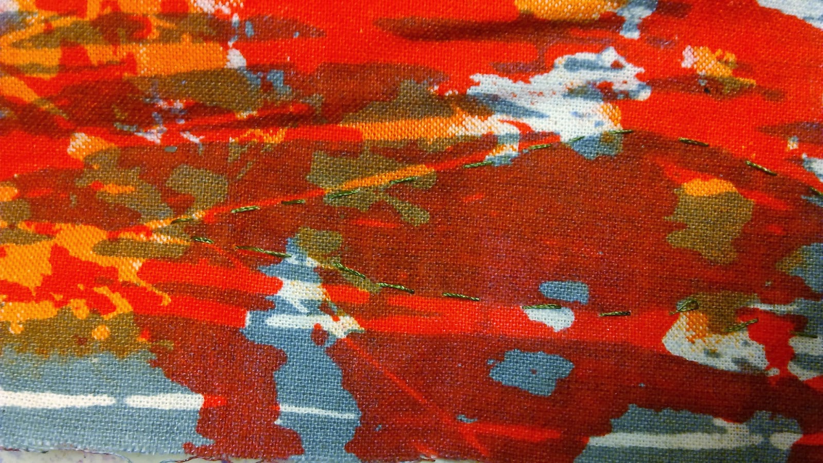
One of the things that i did was to go over the pattern on a piece that i had screen printed to make it stand out more. I did this by 'drawing' around the pattern using a type of black pigment ink.
I also ripped up dyed fabrics and then sewed them back onto a new piece of fabric to get a different effect.
Outlining a screen print pattern.

Cutting and sewing dyed fabric back together.

Adding stitching to my screen print works.

Puff Binding over the top of different fabric textures.

Screen Printing - Textiles Workshop Day 3

In this session of the Textiles workshop, i learnt the process of screen printing.
To do this, i put a piece of fabric/paper onto the table from the previous sessions, i then put the screen over the top of the item i was printing on, ensuring that the pattern on the screen was also on the item beneath. I then had to place the pigment ink on top of the screen, i then put the squeegee blade into the ink, then putting it behind the ink and with some pressure, pulling it down the screen and applying the pattern onto what i was printing on. I then had to take the ink back up the screen again, making sure that all of the ink went through. I then had to scrape off the excess ink and put it back into the pot, lift the screen up and peel my material from the back of it. I then had to wash the screen, taking it to the wash out area and washing both sides with a hose pipe. Once it is ink free i had to place it in the drying cupboard to dry.
I could keep printing onto the same piece of fabric/paper to create more interesting effects.

Health and Safety
Wear protective rubber gloves and apron.
Be aware of wet floors in the wash out area.
My fabric underneath the screen before it was printed. 

After i had covered the image with ink.

My design after removing the screen.